
The question Jim Dodrill grappled with last summer: What’s in a name?
A partner at Pennsylvania-based LMA Architects, Dodrill had been approached by Consumers Petroleum of Trumbull, Conn. to help create a corporate brand for the company’s dozen or more convenience stores in Connecticut. Consumers Petroleum had acquired a handful of existing convenience stores in the state, but preserved the original brands from each of the stores since it never developed a collective identity to use for the entire portfolio.
"The owner of the company, his last name is Wiehl," Dodrill said. "He jokingly changed the (chain’s) name to ‘Wheels.’
"They were sort of concerned it might be too literal," Dodrill said. A number of "image" words were tossed around, but Wheels was agreed upon. "Initially it was almost like an inside joke, but when we met with them, we said it’s actually not a bad name."
Dodrill spent a month sculpting the abstract Wheels concept into a physical reality. It wasn’t old hat for the 30-year-old LMA Architects team, only for the past few years had they been designing architectural concepts for owners and operators of convenience stores, but it certainly wasn’t new ground.
"We liked this whole concept of branding," said Dodrill, whose company also designs upscale residential housing. "This is a great arena to do that in. Convenience stores are all becoming a little more upscale and unique in their looks."
LMA Architects’ past work involved industry leaders like Wawa, the Pennsylvania-based operator of more than 570 Mid-Atlantic convenience stores.
Dodrill and his team designed the sleek, signature canopies shielding Wawa’s refueling areas, and beyond that had branded and rebranded other convenience store chains such as Anglers Mini-Marts in South Carolina, which were redesigned to reflect its early beginnings as a bait-and-tackle shop.
"The clients find it as fun as you do," Dodrill said. "They’re trying to create an image, and they’re open to ideas."
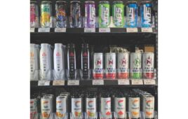
For Consumers Petroleum, Dodrill wanted to create a brand that not only capitalized on the Wheels name, but also imbued the c-store’s image with the notion of quick-and-easy products and services, that staple convenience store offering. For its part, Consumers Petroleum wanted a look that was uniquely upscale.
Because the company’s stores had been acquired as already-operating properties, Dodrill was somewhat limited in changing the building’s exteriors, other than emblazoning signage in key areas.
"We had total control over the interior," Dodrill said. Ultimately, the Wheels brand came to life by using the name to steer design and imagery, everything from texture to colors to lighting.
"It’s more like creating an environment," Dodrill said. "That’s where it gets into these warm materials, textures and colors."
Using a brand name to build a company’s tangible identity—signage, logos and such—isn’t a new concept. (Think Apple computers.) In the competitive c-store landscape, however, a carefully managed branding program can be that something extra to set a brand apart.
Consider Arcadia, Okla. convenience store Pops 66, which also created its brand by integrating words with imagery. The company’s logo features a bottle cap with the Pops 66 name scrawled in retro font, and soda-pop bottles and paraphernalia are in abundance at the Route 66 store.
"It’s old meets new," said Jennifer Ockershauser, Pops 66 marketing manager. "It was a good nod to old Route 66 and the soda shops and your iconic soda-pop bottle."
Pops 66 opened in August 2007, using the classic soda pop concept fused with crisp, vibrant colors to create an unmistakable brand image that Ockershauser described as freewheeling and fun.
"We carry that throughout all of our branding," Ockershauser said.
The end result is an unmistakable Pops 66 brand, and a welcome break from the cliché "grab-and-go" brands Wheels has managed to skirt with its originality.